TRACKER-1
48.8566°N / 2.3522°E

Earth Tracking / Observation journal

Earth, seen from space

Satellite data alert us to humanity’s environmental damage: see it from space, understand it in numbers, measure its acceleration.

Journal of a distant observer

Our planet is a lonely speck in the great enveloping cosmic dark. In our obscurity, in all this vastness, there is no hint that help will come from elsewhere to save us from ourselves.

The Earth is the only world known so far to harbor life. There is nowhere else, at least in the near future, to which our species could migrate. Visit, yes. Settle, not yet. Like it or not, for the moment the Earth is where we make our stand.

It has been said that astronomy is a humbling and character-building experience. There is perhaps no better demonstration of the folly of human conceits than this distant image. To me, it underscores our responsibility to deal more kindly with one another, and to preserve and cherish the pale blue dot, the only home we’ve ever known.

Carl Sagan, inspired by Voyager 1’s Pale Blue Dot photo (1990)

This site tracks craft leaving Earth. Let’s reverse the gaze: stand where they are, and observe the planet they left, as a distant observer would, curious and neutral, blind to our borders but fluent in our signals.

From space, humanity’s environmental damage doesn’t show up in landscapes first: it reads in the composition of the air, the trapped heat, the height of the oceans and the extent of the ice. Four major satellite and instrumental series have documented them for decades, and every one is accelerating.

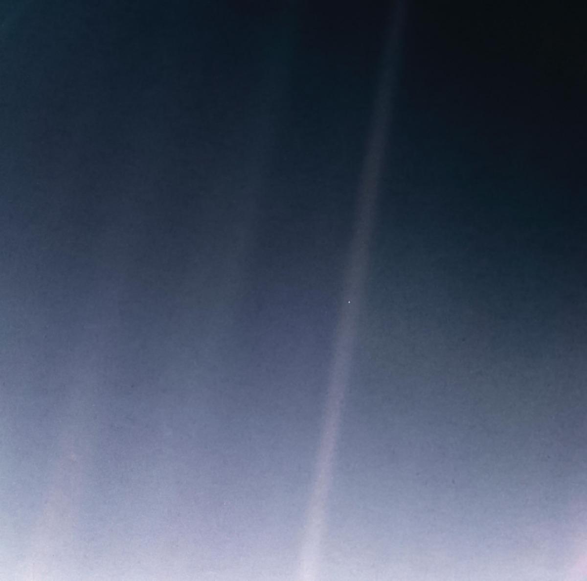
On February 14, 1990, from 6 billion km away, Voyager 1 photographed Earth: 0.12 pixel. In that frame, everything we know fits in a speck of light suspended in a sunbeam. The journal below measures what that speck is going through.

Earth photographed by Voyager 1 from 6 billion km away: a pale blue dot suspended in a sunbeam (the beam is visible at the top right of the image).
Earth occupies less than a single pixel in this frame. One of the Sun’s diffracted rays crosses it: a pale blue dot in a sunbeam.NASA/JPL-Caltech · “Pale Blue Dot Revisited” (2020), from Voyager 1 imagery (February 14, 1990)See the Voyager 1 mission

📡 Live · The surface, right now

The live view

The glowing points are active natural events observed by NASA satellites: vegetation fires (orange), storms (cyan), volcanic eruptions (pink), floods (yellow). Drag to rotate, hover a point to identify it.

Active phenomena · last 30 days

Census threshold: these counters track documented, still-open episodes from NASA EONET and GDACS/GWIS. A local fire or flood appears here only if detected by satellite and/or officially reported: small events may be missing, while major episodes are captured without geographic bias.

All events on EONET (NASA)

📈 The damage, measured one by one

What humanity is doing to the planet, measured from space

Four independent measurement series, tracked for decades by space agencies. Each documents one environmental impact; together they form the global diagnosis. The graphs show the real evolution, the bars compare decades.

🌫️ Impact #1 · The atmosphere

The air we are loading

Since 1958, the Mauna Loa observatory has measured atmospheric CO₂. The curve, the “Keeling curve”, is the longest single record of human impact on the planet: it never comes back down.

Atmospheric concentration since 1958 (ppm)

305350394438195819912026429 ppm

Pre-industrial level (~280 ppm) · 1958 : 314.44 ppm

Average rate per decade (ppm/yr)

0236472316 ppm1950s+0.88 ppm/an320 ppm1960s+0.81 ppm/an331 ppm1970s+1.24 ppm/an346 ppm1980s+1.61 ppm/an361 ppm1990s+1.57 ppm/an379 ppm2000s+2.04 ppm/an400 ppm2010s+2.43 ppm/an421 ppm2020s+2.62 ppm/an

The mechanism

CO₂ lets sunlight through but blocks the infrared Earth radiates back: the greenhouse effect, measured in laboratories since 1859 (John Tyndall). Every extra ppm traps a little more heat. Half of today’s excess was emitted since 1990, since the pale blue dot photo.

The acceleration

The emission rate has more than quadrupled in sixty years: about +0.7 ppm/yr in the 1960s, +2.5 ppm/yr today. The bars below give the average rate per decade: it keeps climbing.

Source : NOAA GML (Mauna Loa) · 428.83 ppm (2026) · ×3

🌡️ Impact #2 · The heat

The planetary thermometer

Thermometers worldwide and satellite measurements converge: every decade since 1980 has been warmer than the one before. The anomaly is measured as a departure from the 1951-1980 average.

Temperature anomaly since 1880 (°C)

-0.620.030.671.321880195120251.19 °C

1951-1980 reference (= 0 °C) · 1880 : -0.17 °C

Average anomaly per decade (°C)

-0.40.41.2-0.21 °C1880s1890s1900s1910s1920s1930s1940s1950s1960s1970s1980s1990s2000s0.81 °C2010s1.07 °C2020s

The mechanism

The extra energy trapped by greenhouse gases is equivalent, for the globe’s surface, to Hiroshima atomic bombs per second: climatologists’ reference math is ~4 Hiroshima/second averaged over a year. Over 90% of that heat goes into the oceans: the atmosphere is only the visible part.

The acceleration

Warming is accelerating: the 2015-2024 decade jumped about +0.3 °C over the previous one, the largest inter-decade rise ever measured. Each bar below is a decade’s average.

Source : NASA GISS (GISTEMP v4) · 1.19 °C (2025) · ×6.3

🌊 Impact #3 · The oceans

The rising sea

Since 1993, satellite radar altimeters have measured the mean height of the oceans to the millimetre. The sea rises because warm water expands and ice melts.

Global mean sea level since 1993 (mm)

-30.611.152.994.619932010202581.0 mm

1993 reference (= 0 mm) · 1993 : -21.97 mm

Average rate per decade (mm/yr)

-9.437.484.2-8.21 mm1990s+3.08 mm/an14.38 mm2000s+2.65 mm/an41.60 mm2010s+4.28 mm/an75.20 mm2020s+4.65 mm/an

The mechanism

Two-thirds of the rise comes from thermal expansion: warm water takes up more room (elementary physics). The rest comes from melting glaciers and ice sheets. More than 400 million people live within 5 m of sea level.

The acceleration

The rise is accelerating: ~1.8 mm/yr in the 1990s, over 4 mm/yr today: the rate has more than doubled in thirty years. At this pace, this century’s rise will far exceed half a metre.

Source : NOAA LSA (altimétrie satellite) · 80.98 mm (2025) · ×1.5

🧊 Impact #4 · The ice

The melting ice pack

Since 1979, microwave satellites have measured Arctic sea ice extent. Its September minimum, the end of the Arctic summer, is the clearest witness of warming: the polar summer now opens an ocean where ice used to be.

September sea ice extent since 1979 (million km²)

3.244.836.418.001979200220254.75 millions km²

First satellite measurements (1979-1981) · 1979 : 7.05 millions km²

September average per decade (million km²)

0 %56 %112 %100 %1980s-0.03 millions km²/an92 %1990s-0.01 millions km²/an78 %2000s-0.20 millions km²/an65 %2010s+0.00 millions km²/an63 %2020s+0.04 millions km²/an

The mechanism

White ice reflects 80% of sunlight back to space. When it melts, the dark ocean absorbs that energy and heats up, melting more ice: the Arctic amplification loop. The Arctic is warming nearly 4 times faster than the global average.

The acceleration

September extent has shrunk about 13% per decade since 1979. Records fell in 2012 and 2020: nearly half of the summer ice pack has vanished compared to the first satellite measurements.

Source : NSIDC / NASA · 4.75 millions km² (2025) · ×1.5

The global diagnosis

The acceleration, at a glance

Each indicator reduced to its per-decade rate. The same motion everywhere. The ratio between the latest decade and the first is the damage multiplier.

The air we are loading+0.88 ppm/an+2.62 ppm/an×3
The planetary thermometer-0.01 °C/an+0.07 °C/an×6.3
The rising sea+3.08 mm/an+4.65 mm/an×1.5
The melting ice pack-0.03 millions km²/an+0.04 millions km²/an×1.5

These comparisons are about rates, not absolute values: they tell how fast each system is being destabilized.

The scale of things

Taking the measure of the dot

Before heading back to the stars, a few comparisons to give this pale blue dot its true size.

The habitable atmosphere

The layer of air where life is possible is about 10 km thick. On an apple-sized globe it would be thinner than the skin: that’s all that separates us from the void, and it’s where we pour 37 billion tonnes of CO₂ every year.

0.12 pixel

In Voyager 1’s 1990 photo, Earth occupies less than one eighth of a pixel. Every war, every discovery, every person you love fits in that fragment of light.

Five hours forty-five minutes

That’s how long light took to carry the pale blue dot image to Voyager 1, 6 billion km away. Perspective is also measured in light.

No visible borders

From space, none of the borders we draw can be seen. The planet appears as a single system: one dot, one destiny.

Final transmission

Protect the pale blue dot

No craft tracked by this site will ever find a backup planet. The only habitable planet we know is this one, and every curve on this page shows the same motion: runaway change. The first space gesture isn’t to leave: it’s to understand where we’re starting from.

Sources & methodology

Every value shown comes from an official agency and carries its measurement date. No data is extrapolated or smoothed by us.

  • Natural events · NASA EONET v3 (Earth Observatory Natural Event Tracker), open events from the last 30 days. Floods complemented by GDACS (EU/UN alert system, GLOFAS/Copernicus source): the EONET flood feed is hand-curated and can stay empty.
  • CO₂ · NOAA Global Monitoring Laboratory, Mauna Loa monthly series (Hawaii), deseasonalized trend.
  • Temperature · NASA GISS Surface Temperature Analysis (GISTEMP v4), annual anomalies vs 1951-1980.
  • Sea level · NOAA Laboratory for Satellite Altimetry, global mean by multi-mission altimetry (TOPEX/Poseidon, Jason, Sentinel-6).
  • Arctic ice · NSIDC Sea Ice Index v4, September extent (annual minimum), satellite series since 1979.
  • Decadal rates computed from these same series (linear regression per decade).